
Tesla | In-Car Experience Redesign
UI/UX Case Study
Improving driver interaction through a safer, more intuitive touchscreen experience

PROJECT OVERVIEW
Tesla is widely recognized for its software-first approach to automotive design, replacing traditional buttons with a minimalist touchscreen interface.
While this creates a clean and futuristic interface, it also introduces challenges when drivers need to access critical information quickly while maintaining focus on the road. This project explores how Tesla’s touchscreen experience can be redesigned to make common actions more discoverable, reduce interaction effort, and provide a more personalized driving experience.
My goal to explore was, how might we create a touchscreen experience that feels more intuitive, reduces interaction complexity, and improves driver confidence?
ROLE
-
UI/UX Researcher
-
Product Designer
TOOLS
-
Figma
-
Adobe Creative Suite

Observed UX Challenges


Challenge 01
Navigation (Map)
Making Favorite Destinations Easier to Discover
UX Observation
Saving destinations as Favorites lacks discoverability
When navigating to a destination, the option to save a location as a Favorite is not immediately visible from the primary navigation experience. Users need to explore additional interactions before discovering this function.
Although the feature exists, its placement creates unnecessary friction for a commonly used action.
User Impact
Design Improvement
Introduce a more accessible Favorite action within the navigation workflow
I redesigned the navigation experience by making the Favorite function more visible at the moment users interact with a destination.
The updated experience allows users to:
-
Save destinations directly from the navigation screen
-
Quickly access frequently visited locations
-
Reduce unnecessary navigation steps
User Flow Design
Prototype Walk-thorugh
Solution: Add Favorite button on the main Map screen
Pros: Users can add Fave even during their trip


ADD FAVORITE OPTION
Redesigned the interface by adding a persistent "Add Favorite" button next to "End Trip," allowing users to quickly bookmark destinations while driving. Once a destination is saved, the button updates to "Favorited," providing clear confirmation and making it easy to access the location for future trips.


UX Observation
Limited driver and passenger temperature personalization
Tesla’s climate interface provides temperature control through a shared system. However, drivers and passengers may have different comfort preferences, creating situations where one setting does not satisfy both users.
Additionally, users adjust comfort by selecting a temperature value rather than directly controlling their perceived airflow experience.
User Impact
-
Driver and passenger preferences may conflict
-
Users spend additional time adjusting settings
-
Climate interaction becomes less intuitive during driving
Design Improvement
Enable independent driver and passenger climate controls
I redesigned the climate interface to provide clearer dual-zone personalization.
The updated design introduces:
-
Separate driver and passenger temperature controls
-
More intuitive visual feedback
-
Easier airflow adjustment
User Flow Design
Prototype Walk-thorugh
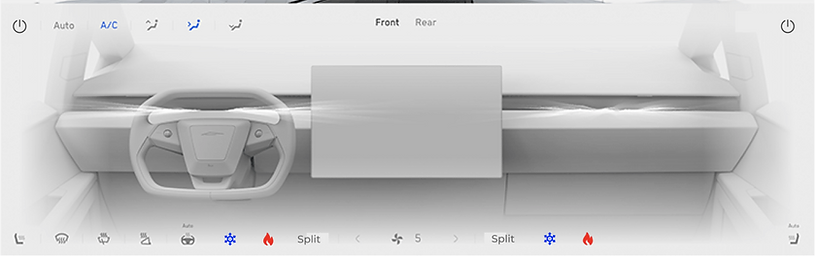
Solution: Add suggested Cold/Hot temp button & Add Split option on the A/C control menu
Pros: Users can control freely of their desired temperature and A/C service faster more precisely
FAVORITES OPTION
Cold/Hot Mode: Added one-tap Cold and Hot presets that automatically adjust the cabin temperature based on the current weather conditions, providing a faster and more comfortable driving experience.
SPLIT OPTION
Split Temperature Control: Allows the driver and passenger to independently adjust their preferred cabin temperatures for a more personalized comfort experience.
ON / OFF OPTION
Temperature On/Off: Allows users to independently turn climate control on or off for the driver and passenger, providing greater flexibility and personalized comfort.
Challenge 03
SPOTIFY / MUSIC
Improving Music Discovery and Playback Experience
UX Observation
Music controls lack clarity and playback information
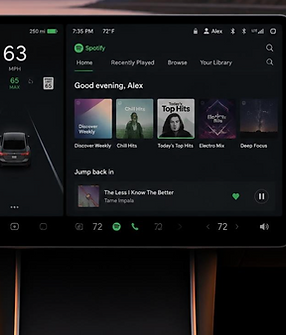
While Tesla integrates Spotify into the vehicle experience, several interactions create usability challenges.
Observed issues include:
-
Users cannot view lyrics while listening
-
Selecting the Spotify logo redirects users to Spotify Home instead of the current playback experience
-
The "Now Playing" icon resembles a playlist icon, making its purpose unclear
User Impact
-
Users spend additional time searching for playback information
-
Navigation between music states feels inconsistent
-
The listening experience becomes interrupted
Design Improvement
Create a clearer and more immersive music experience
I redesigned the music interface by improving playback visibility and navigation clarity.
The updated experience includes:
-
Lyrics access within the Now Playing view
-
A clearer Now Playing icon
-
More intuitive separation between Spotify Home and active playback
User Flow Design
Prototype Walk-thorugh
Solution: More Spotify User friendly menu bar & Add lyrics on the music screen
Pros: Users can be more familiarize to their music screen & Lyrics can be displayed for users, allowing them to enjoy the same music experience as they would on Spotify.

LYRICS OPTION
Lyrics: Displays synchronized song lyrics directly on the music screen, allowing users to follow along without opening the Spotify app.
Overall Design Objectives
Across all three features, my redesign is guided by the following UX principles:
-
Improve discoverability by making frequently used actions easier to find.
-
Reduce interaction cost by minimizing the number of taps required for common tasks.
-
Support driver safety by limiting visual and cognitive distraction.
-
Preserve Tesla's minimalist design language through contextual interactions rather than additional interface clutter.
-
Design for scalability so future features can be integrated without disrupting the existing experience.
